The Mindful effects of colour
Although we may have a solid notion of the colors we are particularly drawn to, most of us don't actively consider the reasons behind these decisions. It is also all too easy to let our excitement over trends cloud our perception of the colors with which we truly connect. It may seem apparent when said clearly, but take a moment to check in with your emotions and consider how you want those colors to make you feel before committing to any color choices, whether for decor or anything else.
Although most of us are aware of the broad generalizations (blue can calm us; yellow can make us joyful), color psychology is a complex subject with many variables at play.

Karen Haller, an applied color psychologist, explains how light entering our eyes produces the production of a chemical transmitter, which in turn affects our minds and emotions: "Colour speaks to us in a language we instinctively understand—the language of emotions—and it influences our behavior without necessarily being conscious of doing so."
According to research, the wavelength of each color has an impact on how we perceive it. Shorter wavelength colors, such as warm neutrals, blues, and greens, are easier for our brains to process since they are in the middle of the color spectrum. As a species, we are bred to choose the easiest route. Longer wavelengths make colors like red, orange, and yellow seem closer to us than they actually are, which can cause a stronger reaction. As a result, these colors are often associated with more exciting emotions like passion and excitement or danger and fury.
Color psychology articles frequently describe what colors trigger specific emotions, but it can be far more difficult to figure out how to develop a complete color palette for designing. It's a good idea to start by deciding how you want a certain area to make you feel rather than how it should look. Here are a few suggestions to assist you in developing a customized mood-inspiring palette.
1. Decorate for rest (blues/greens)
Blues and greens, which are complementary colors that sit next to each other on the color wheel, possibly have the greatest range of tones. These colors, which bring us closer to nature, blend almost magically to produce a room that seems serene and well-balanced. Blue calms the nervous system and can even help treat sleep issues, while green promotes emotions of peace.

How to use:
The least amount of visual noise can be achieved by using a strictly tonal palette, where each color is simply a lighter or darker version of itself. However, this approach may feel bland. In contrast, using blue and green colors with similar saturation (such as two light tints or two bold darks) can add some variation. Generally speaking, when your goal is to relax, stay away from choosing extremely dark or saturated variations of these colors since they can feel depressing. On the other hand, stay away from more brilliant hues of turquoise and lime because they can energise.
Pair with:
When used properly, white, a 'pure' color that promotes calm and simplicity, can appear relaxing (warmer tones prevent a cold or sterile feeling). Even if it's just a small element, like a red mug to sip your first cup of coffee from, adding a touch of red can energize things if you've chosen peaceful hues for your bedroom but find that you need motivation to get up and go in the morning.
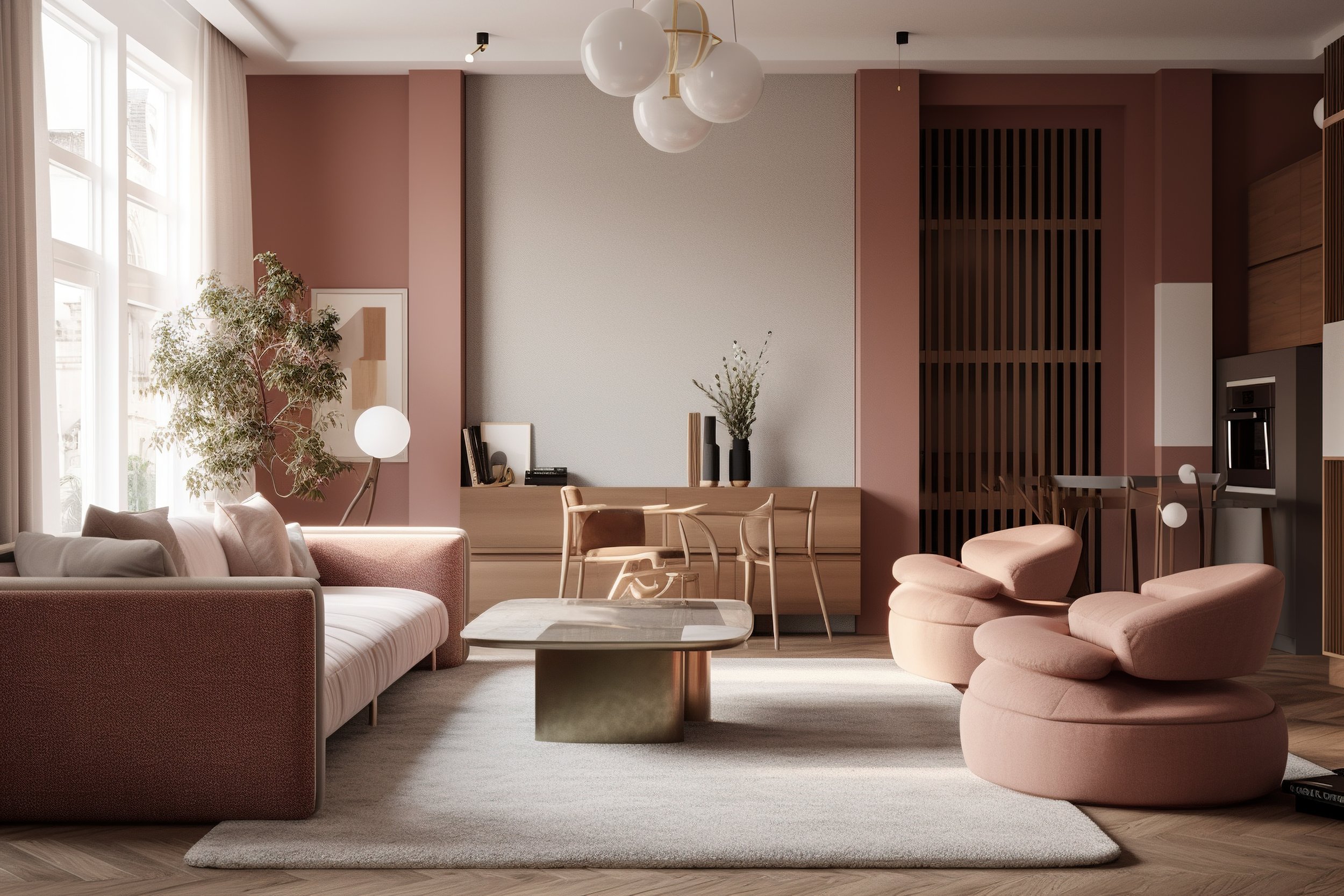
2. Decorate for calm (pinks)
Pinks have subtly replaced grey as a sophisticated "new neutral" in recent years, and given how volatile the globe has become, it's possible to argue that this shift is not random. According to the American Institute of Biological Sciences, pink even decreases heart rate and blood pressure while calming the vibe of a room and enhancing sentiments of empathy and affection.
How to use:
Pink's feminine associations may make some people hesitant to use it in the home (or, at least, not in social places), but less obvious tones like peach, salmon, and terracotta are surprisingly simple to live with as a backdrop and provide a warm and inviting virtual embrace to all sorts of room.
Pair With:
Gentle pinks go beautifully with darker berry tones and warm rose gold for a more grown-up twist, though in a tranquil room, limit the berry tones to highlights only to prevent overstimulation. On the color wheel, green is precisely opposite pink since it is naturally relaxing. However, if you chose muted (as opposed to vivid) versions of both tones, the impact will still be calming.
3. Decorate for energy (oranges/yellows)
Bright, intense oranges and yellows can uplift the spirit and increase self-confidence. They are the perfect colors for social spaces like mixed-use living or dining rooms (orange is supposed to increase hunger in particular), or even in a kid's playroom to convey joy and frivolity.

How to use:
Keep in mind that you cannot, so to speak, "turn off" these tones. If you're really committed to the idea of creating a happy, energy-enhancing area, go all-out with these hues. However, if the room will also need to be used for calm and reflection, you might find that these hues annoy or even distress you. If in doubt, keep them to a minimum or limit their use to temporary spaces, like a corridor or the cloakroom downstairs.
Pair with:
Use brown hues to (literally) ground their colorful impacts (as well as softer colours like taupe and putty for a lighter mood). Blues may be used in a variety of ways to create contrast, from dynamic tones like aqua to calmer, seascape-inspired hues that can balance the palette and help us focus.
4. Decorate for creativity (purples)
Purple (including lilac and violet), the color at the extreme end of our visible spectrum, has long been linked to spirituality and an awareness of a higher plane of existence. It is frequently associated with meditation because of these long-standing linkages to reflection, but it is also connected to igniting creativity and curiosity.
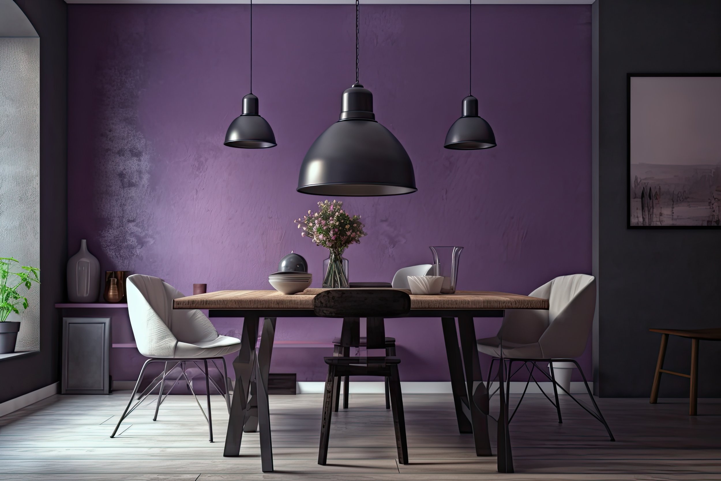
How to use:
In a study or quiet setting, a soft, misty light to mid tone works beautifully wrapped across all four walls for a slight lift. Darker purples will add impact to a specific area, such a feature wall behind a desk or a snug corner with artwork or soft furnishings. Furniture and accessories with iridescent and pearlescent surfaces play with these hues to give the pieces an ethereal feel.
Pair With:
If you want your area to energise you and inspire creativity, choose colors such as yellow and purple, which go well together and are also known to boost confidence. Grey can tone down any sweetness in the purple of your choice and create an area where external stimuli are muted, allowing you to focus undistracted.
Anecdote
Do you ever have the feeling that pristine, shining white is cold and unforgiving?
That's perhaps because it's a completely artificial tint that doesn't exist in nature,
making it difficult to relate to.